As ECD for Edible, I hired and guided a talented team of writers, art directors, ux & graphic designers as well as social strategists and external agencies past the expected ideas and created work that evolved and repositioned the Edible brand as a unique proposition people wanted to have an affinity with. Worked closely with our marketing and brand strategists to translate business need to creative ask, and then inspired the team to concept rich ideas that could be executed well. I also led the new brand strategy and creative direction for an organization enduring a company wide reorganization, restructure and relocation.
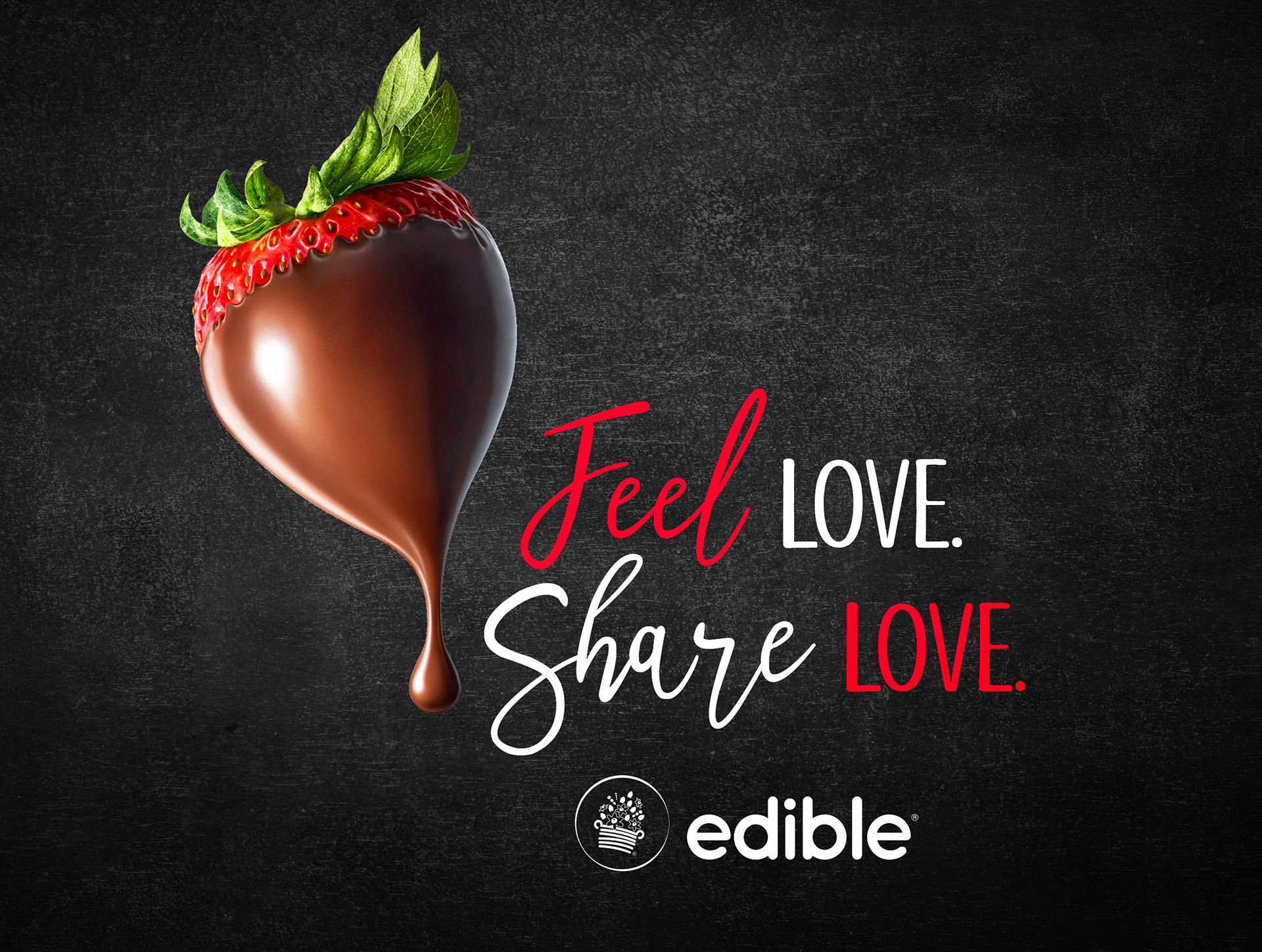
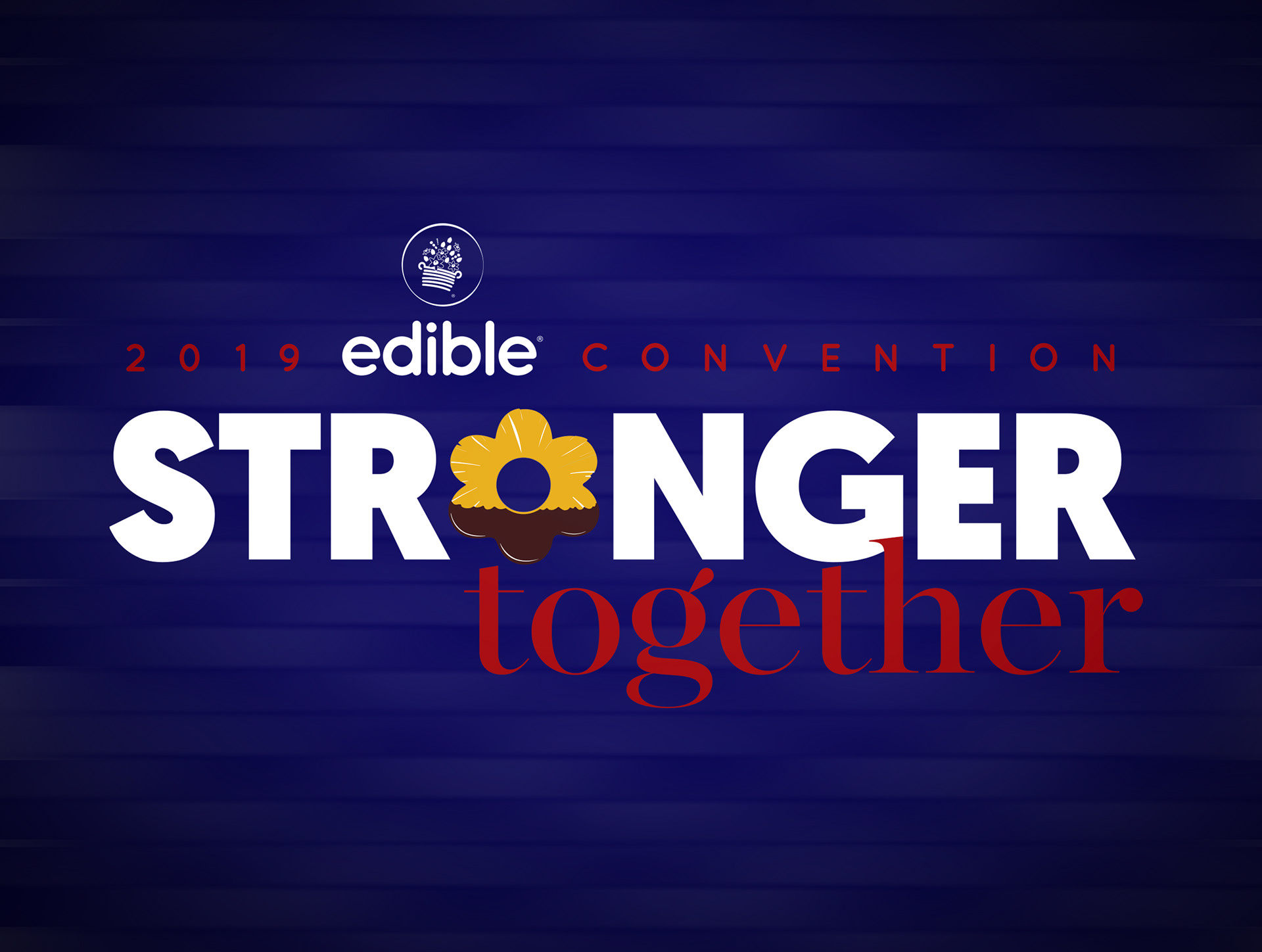
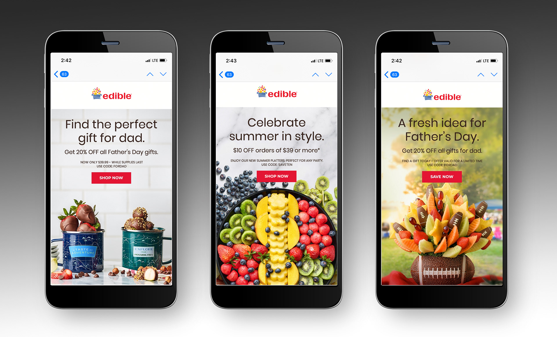
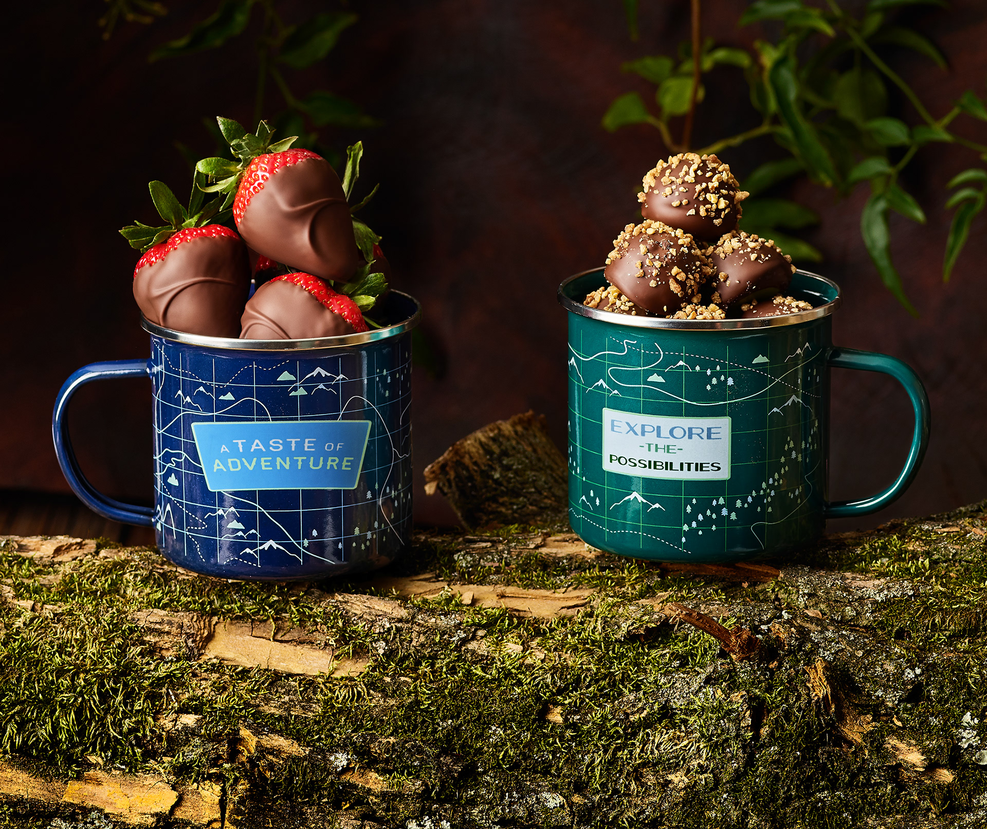
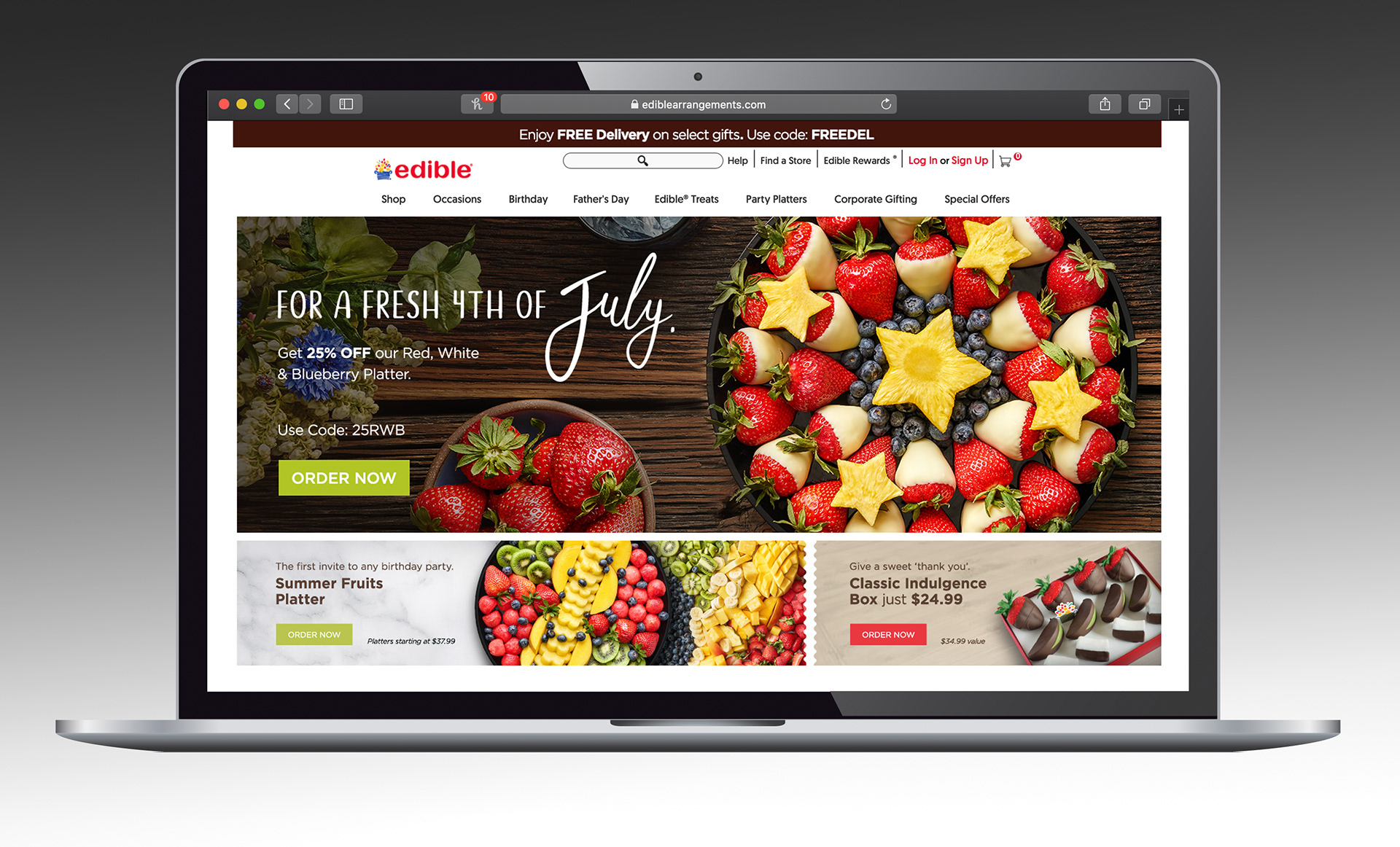
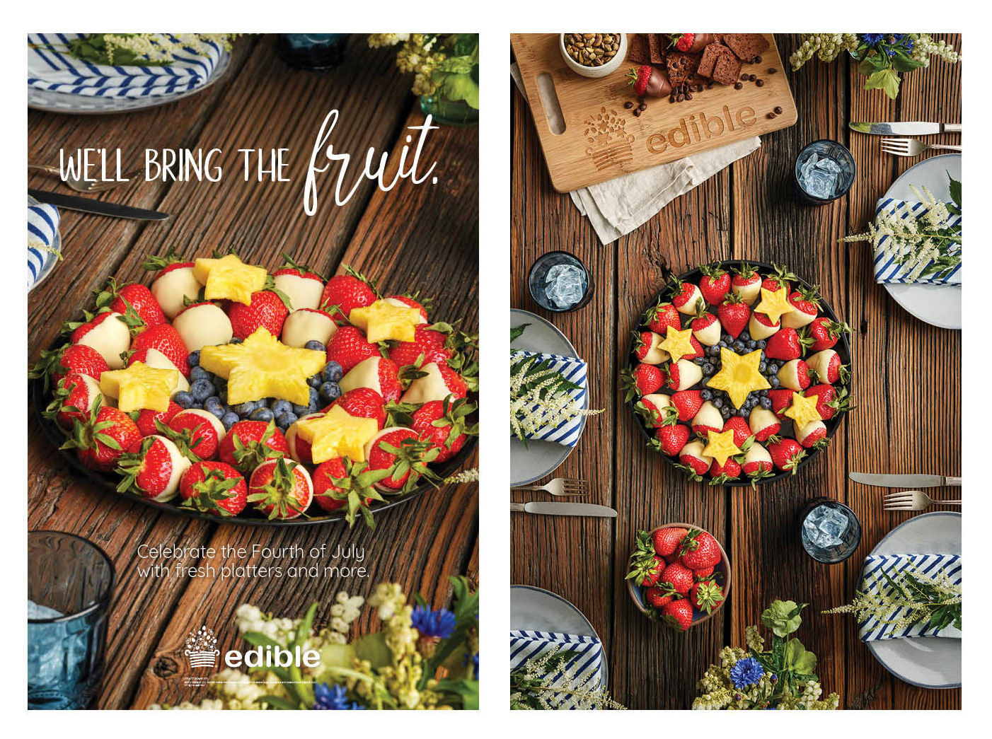
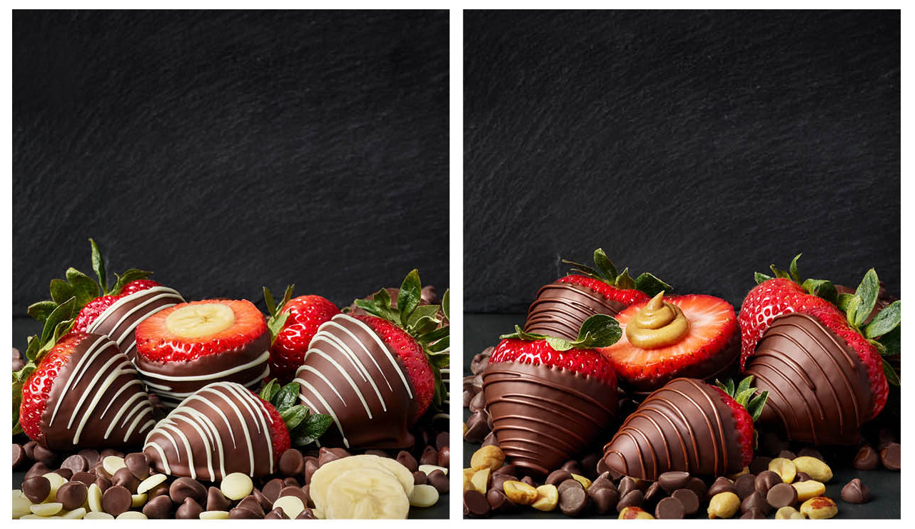
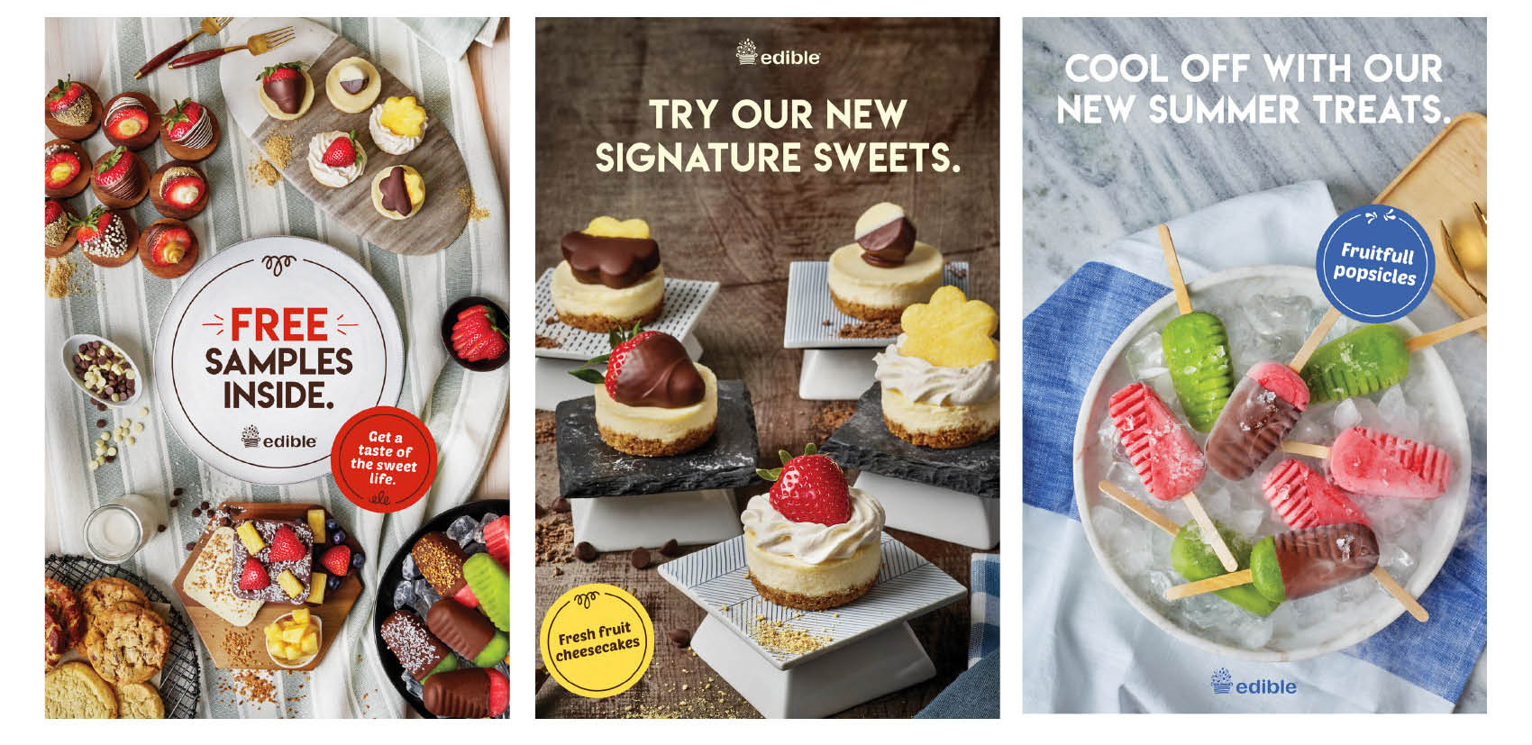
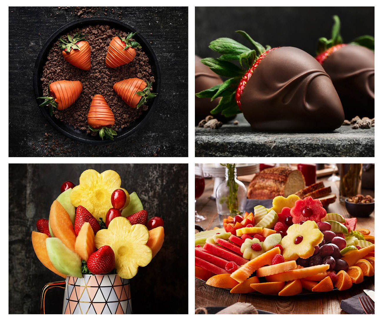
The images and videos below represent some of our incredible achievements:
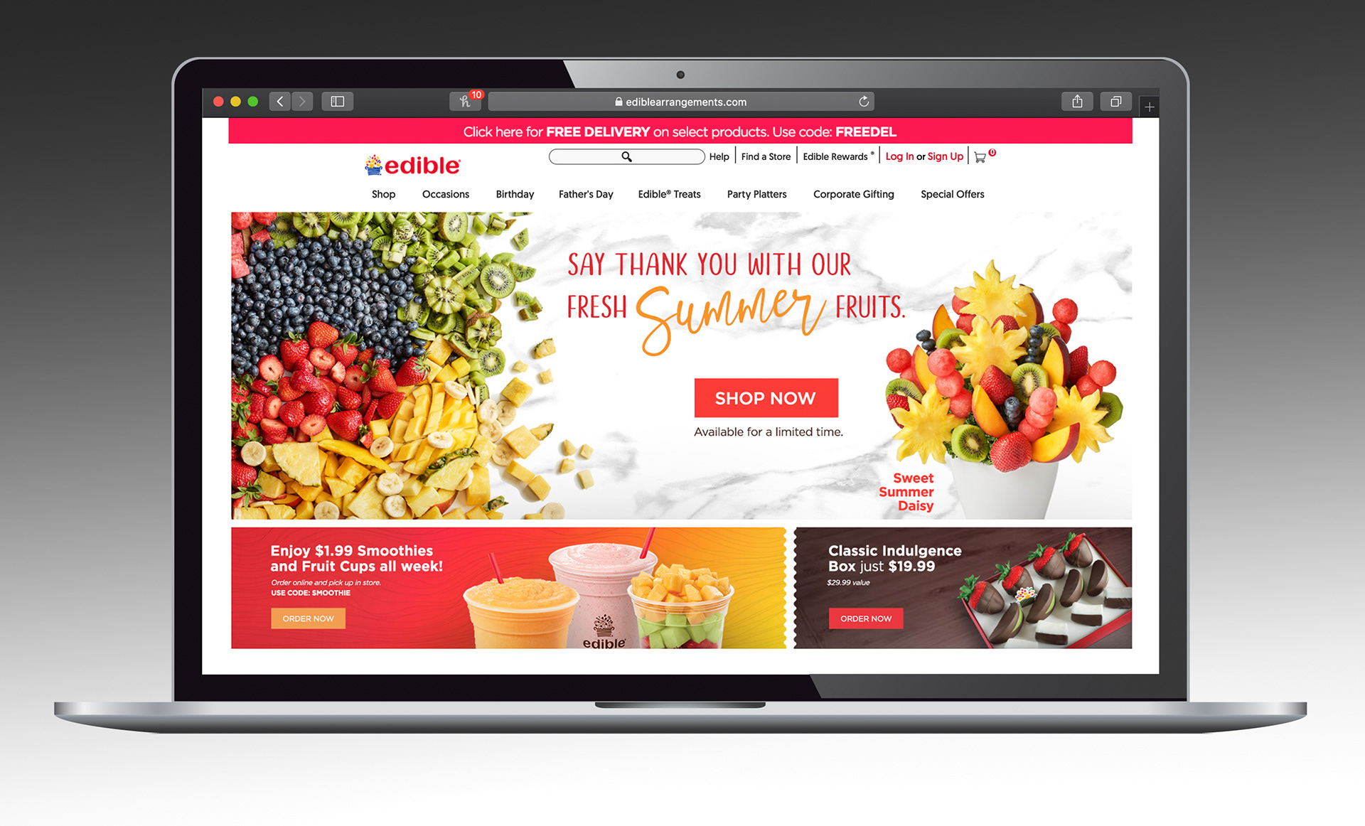
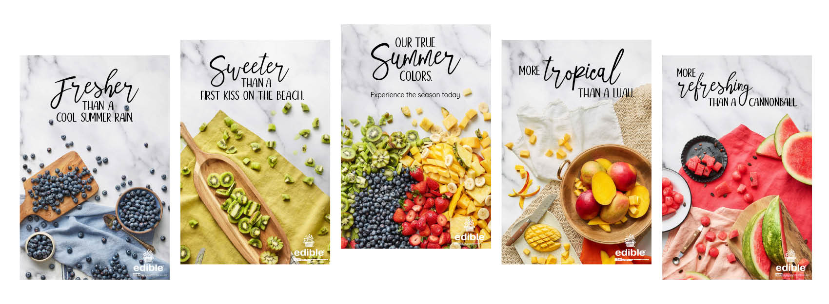
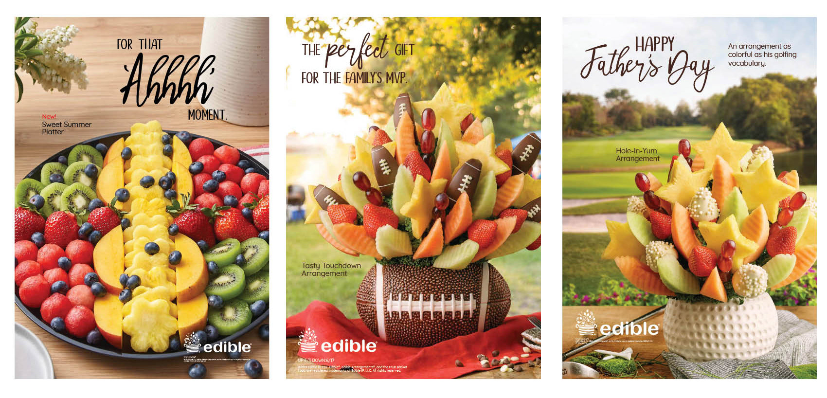
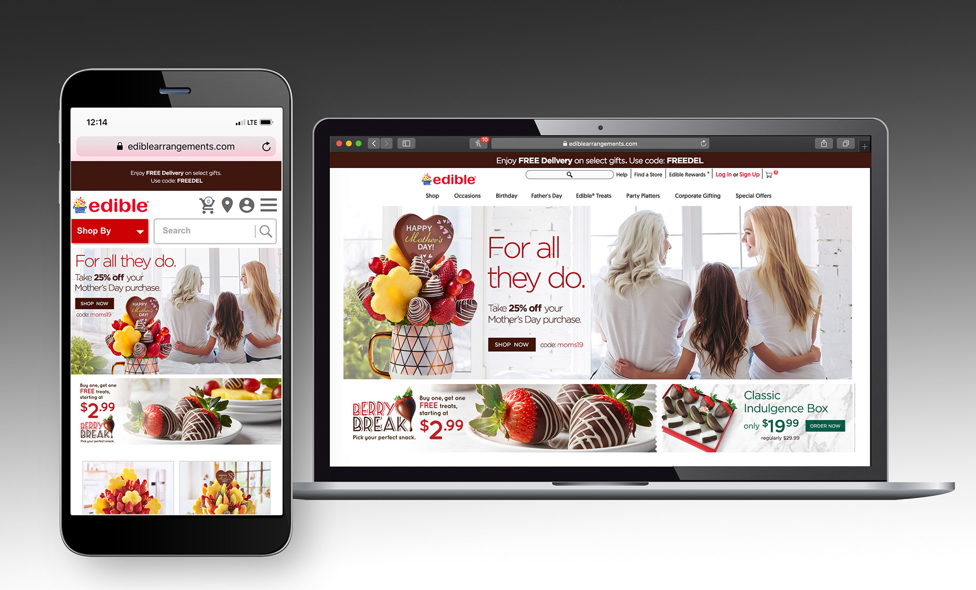
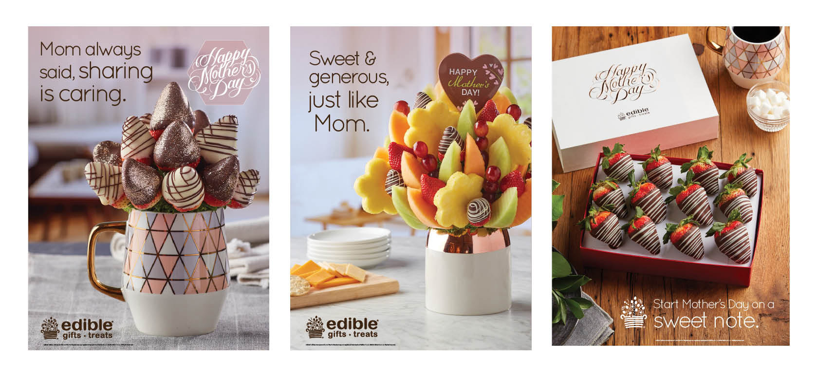
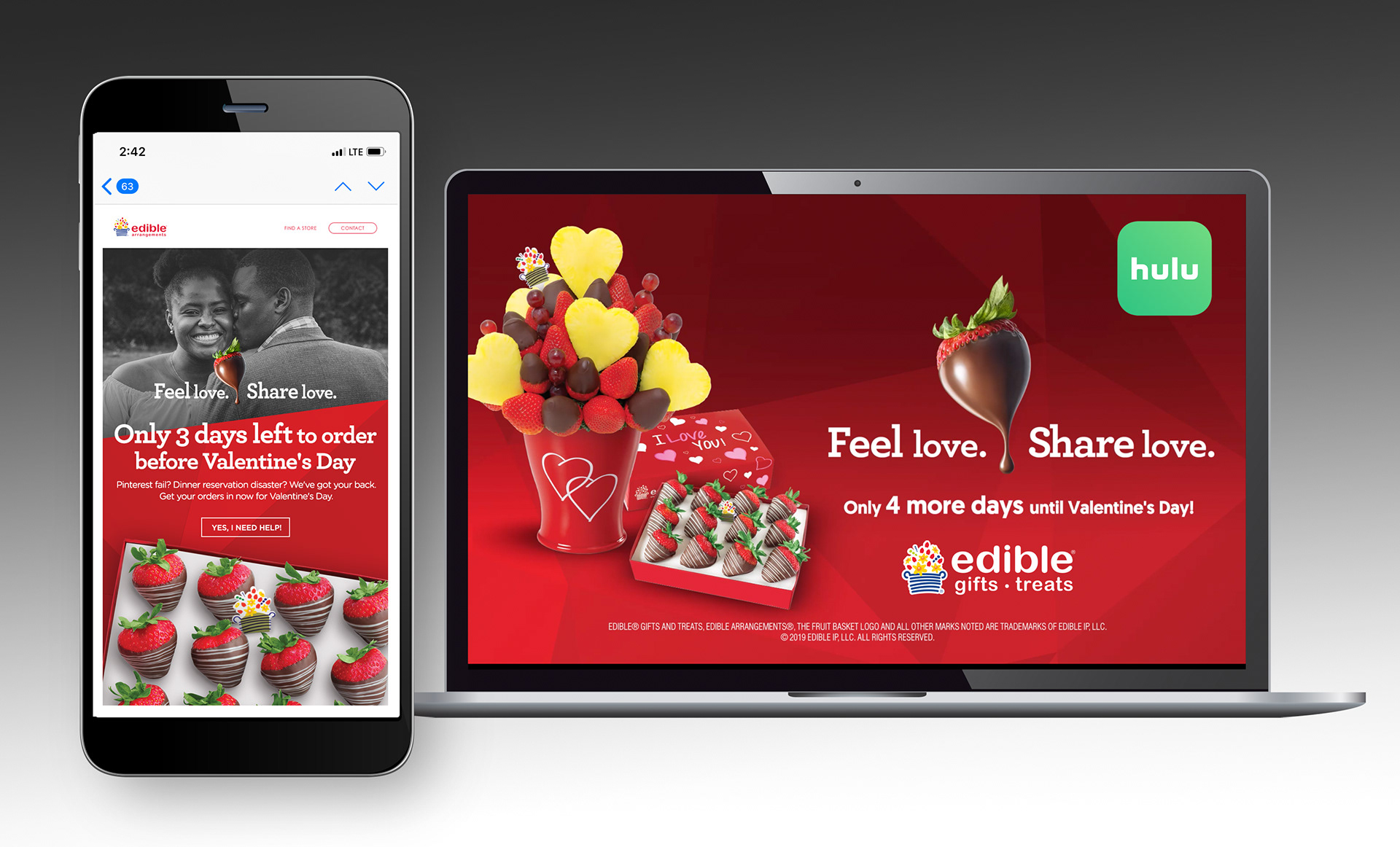
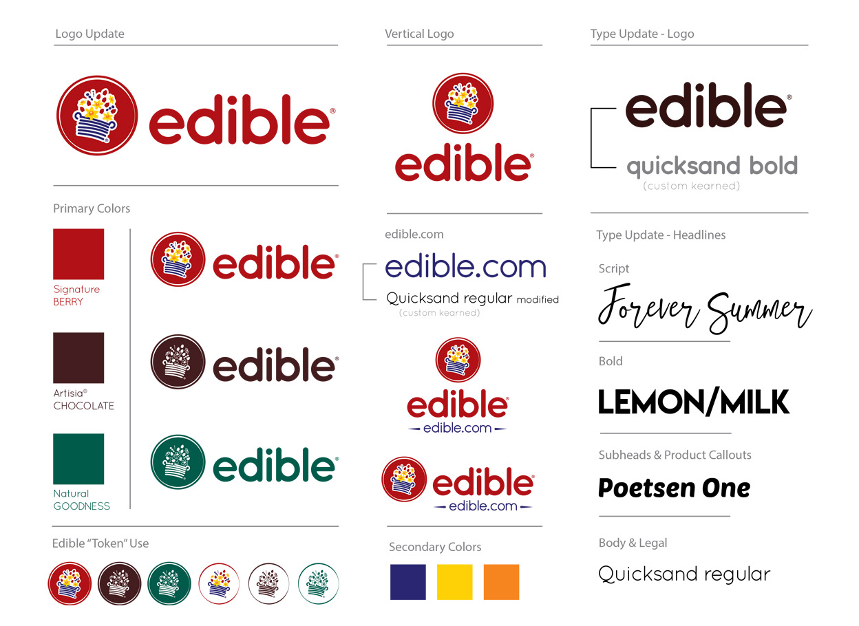
There is a lot to be said about the work above - the team, the environment, the pace and the passion - but we'll save that for another day. Regardless, we have a lot to be proud of in such a short period of time. When I first started at Edible, every external voice (colleagues, friends, vendors, etc) wanted to know if I would attempt to change the logo. "Please change the logo. What's with the logo. Good luck with that logo."
I knew it wasn't my immediate priority. Many big name agencies have tried. And many big name agencies have been fired over this logo. And I had plenty on my plate. We were working on so much so fast. The brand was evolving before our eyes. So indeed, there was an opportunity. We knew the basket represented 20 years of Edible and more importantly, a founding family heritage. Respect to the basket. So we took the opportunity to modernize and create a newness with a cleaner font, colors with more depth and life, and to pay tribute to the iconography.
Lasting legacy? Who really knows. But I'll keep a close eye on it.